Search This Blog

Monday, 27 April 2009

Olympic 2012 Logo


I saw the image above with the altered Olympic Logo and thought I would give my opinion on the logo. A lot of people hate it because it's ugly but I think this has worked in it's favour because it has gained lots of exposure. Therefore it can only be a success if it is promoting the Olympics more. The amount of money it cost is stupid but it does it's job well and when I have seen it in different applications and with different colours and patterns in media it has worked really well.

Olympus Ads


I
 have included these purely because I like the design of them. They were found on AdGoodness and advertis the zoom on Olympus cameras but that isn't immediately obvious.

Stihl Typographic Adverts


Ambient Media


S
omething I am really interested in is ambient media as it can give longer lasting effects and works by word of mouth. If it is good enough it will make people smile and get people talking. It uses humour to grab your attention in most cases and these examples are quite strong in what they represent which is immediately obvious so they do their job.

Making Faces...Like The Police Do


I have just come across a site where you can create faces from thousands of different combinations in the same way as a police photo fit. I found this on a blog off designfloat and it is potentially a great design tool if you want to make up a character to exactly the way you want it to look. Above is a few attempts I had at making the faces.

Photo Manipulation


These are some extremely well shot photographs which have been manipulated in photoshop to get their idea across. They look fantastic due to the quality of the manipulation which is so good that it looks natural. A lot of the time photo manipulation can look rushed which makes it look very cheap and doesn't inspire confidence from an advertising perspective.

Clever Photography


P
hotography is something I am very interested in but don't get much time to do. I'm not interested in normal photography of landscapes etc as it bores me. I prefer it to have an idea behind it which,in turn, turns it into a design in itself. These are examples I found on Just Creative Design which is a great website to look at for inspiration in all areas of design.

Pepsi Advertising


Whilst looking at advertising on the internet I found an ad campaign for Pepsi which wasn't groundbreaking but it really got my attention due to its humour and the way it doesn't try too hard to be successful even though the images are forced and photoshopped.

Pronet Advertising


I had a look through the website of Pronet Advertising which had a slideshow of really clever and witty adverts which I thought I should include in my blog. All of these are ideas based ads which get the point across quickly in a unique way. This helps them to stand out from the rest which will cost more but in the long term the exposure will pay for itself.

Clever Packaging Ideas


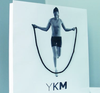
These images from PronetAdvertising show the use everyday items such as straws or bags can be to advertising. They are very simple but effective. They might be something you would want to keep rather than throw away straight away. This makes the cost of this advertising worthwhile.

Alan Heighton


Whilst looking through my friend's portfolio I came across Al Heighton, who he had designed a website before as shown above. The reason I have included his work is that it has a vivid graphic style to it and is a style I'd like to use in my own work in the future. Most illustration doesn't inspire me at all but this is one of the few exceptions.

Adidas Dream Trainers


The idea behind this concept is that a person dreams about trainers all day and imagines their combinations. It's not a very clever idea and the images look contrived but they are amusing and caught my eye so I thought I would blog them.

Ad Sneeze


Ad Sneeze is a website full of the good and bad of advertising created around the world. There are different styles of advertising on there ranging from stylistic to ideas based. My personal preference is for the idea to be predominant but as can be seen above the Bravia idea uses the image which really captures the eye. But I suppose thats the idea in itself.