
Monday 30 November 2009
Saturday 28 November 2009
AOL becomes Aol. Wolff Olins Rebrand

Wolff Olins New York has created a new identity for one of the internet's pioneering (but now ailing) brands, AOL
The brand, which introduced millions to the wonders of the world wide web, has struggled to stay relevant in recent years. A New York Times report reveals that AOL chairman and chief executive Tim Armstrong even considered dumping the AOL name altogether as it prepares to be spun off from Time Warner.
Instead, he asked Wolff Olins in New York to help turn it around. Wolff Olins' solution involves using a set of hundreds of different backgrounds to sit behind the new mark in which AOL is written Aol. (don't forget the full-stop).
Its use of interchangeable imagery is a similar approach to that employed by WO for New York whereby the basic logo could be filled with various images to add freshness, while the goldfish is somewhat reminiscent of a piece of work by one of WO's founders - Michael Wolff's logo for The Consortium.
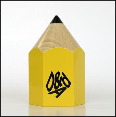
Dave Sedgwick Lecture


A couple of weeks ago Dave Sedgwick, of 999 Design, came into college to talk about his experience in the design industry. The talk was about his journey through design, his advice on getting a job and also a portfolio of his work.
Dave came to Manchester a few years ago to study a D&AD course at Manchester Metropolitan University. He had 2 placements in which he found he liked working at one and didn't at the other. This showed that placements are beneficial not only to the employer but also to see if you want to work at certain places.
He then moved onto talk about portfolios. When showing a company called Dinosaur his work, he got a lot of negative feedback but he persevered and ironically ended up at the same agency on his first placement so he tells us never to give up. His first real job was at LOVE but he unfortunately got made redundant in 2003 which forced him into freelancing. He then ended up getting the job as senior designer at 999 and has worked there ever since.
He told us the way the time is divided at work.This was:
80% designing,
10% account managing,
5% taking calls,
3% making/having tea,
and 2% emailing friends.
The advice he gave us was to start trying to get into the industry now and use time wisely. He tells us to get CV's, PDF's to as many people as possible and to get their names right. He tells us to always check through what we send first incase of mistakes as they reflect badly upon us and also to only show a few examples of work. He also feels we should have a website or a blog and aim it towards agencies. It is all about standing out from the crowd
He also gave up tips for interview as well and portfolios, and how to prepare for them and what to do and not to do. Like talk slowly but don't bore people, and always take advice on board and make sure you always have a leave behind.
I feel the advice was good and I will take it into consideration upon entering the industry.
Thursday 26 November 2009
Mike Rigby - Words of Wisdom

Mike's talk was advertised by posters put up around the design department recently featuring the word WOW which since the talk I have realised means Words of Wisdom. The date on these was 26th October which was wrong as it was meant to say November. Then someone designed a poster that said D'oh in place of Wow with the correct date on. These were placed next to the ones with the incorrect date on. I don't understand why you would want to highlight someones mistake and it makes a mockery out of that person. It could quite easily have been reprinted with the correct date on.
However, aside from this I enjoyed the talk by Mike. He graduated in 2002 and has been in employment at The Chase, Landor, Moon, Pentagram, Mark Studio and has recently been offered the job as Creative Director at Interbrand in Australia.
Mark spoke of the positives about being in the design industry. He said it is interesting, challenging, no two jobs are the same, you get to go on photoshoots, you go on free awards nights and that their is a strong design community. Also, people are helpful and it is easy to work from home or abroad. Aswell as this you can work for worthwhile causes and help give people a voice.
The negatives were the long hours of unpaid work, the competitive nature of the industry and the amount of pressure put upon you. The negative impacts are overpackaged items which is negative on the environment and also information overload. He then went onto speak about Studio structure and the hierarchy of staff which I think was more for the first and second years.
Moving onto the subject of placements Mike did a 6 month placement at Imagination and then did a placement at The Chase. He says placements speed you up and you become ten times faster than before. You get real live projects and you can gain contacts by networking and going on nights out. His advice for getting a placement was to have 6 solid placements in your book, have good ideas well executed, impress tutors and do well at interview. To get the most out of a placement you should socialize, be enthusiastic and positive. He advised us to not let rejection get to us as it does not mean you aren't good enough and will only make you stronger.
Also starting on a low wage isn't all that bad, Mike started on 13k and left only a couple of years later on 23k. His first project was ironically the project that we worked on at the Liverpool Design Symposium during The Chase's workshop. He achieved what was required and the underlay outsold carpet at the company for the next 2 years which shows what good design can do to sales. With his design he also achieved a 350% store card uptake increase which shows it doesn't have to be a glamorous brief to achieve results.
Aside from design, Mike has travelled the world and advises us to do the same as it is the best thing he has ever done. He then eventually got a job working at Landor in Australia whilst travelling where he was paid more and had amazing views from the studio. He believes british designers are highly exportable due to superior ideas whereas other countries are more strategic. I have found this when showing my work in New York. He is now working at True North until he leaves to travel again before he takes on his new job with Interbrand.
He says a lot of his time is spent producing brand guidelines which show the look, font, colours and tone of voice of a brand. Although he likes to make time to do self initiated briefs and advises us to do them aswell.
Overall Mikes advice to us as students is to broaden our horizons and look at all types of media. Experiment whilst you can and you are in education. Crit and collaborate with other students. Above all belive in yourself.
Wednesday 25 November 2009
One Minute Brief- Poster Levi 501 Jeans

The idea was to make the 1 and I look like they are walking legs in the Jeans.
One Minute Brief- Chest of Drawers Poster

I tried to do a different take on the usual boring furniture posters you see and add a bit of humour into this poster for a chest of drawers.
One Minute Brief- Rover Poster Design

This is a poster created to advertise Rover car company within one minute.
One Minute Brief- Naming and Logo Design

Within one minute I had to come up with a name and design the logo for a Shock Absorber company.
One Minute Brief-Logo Design

A design created in one minute for Chelsea International Hostel in New York.
Design Solution Before Seeing the Brief


Recently, after having the idea for the 1 minute briefs, I had another idea which also had to be completed in one minute.
Working against someone else you have to design a poster or logo. You can do anything you want as you only find out what the brief is once you have completed the design. The winner is the design that is most relevant to the set brief.
This allows for total freedom of ideas and you can literally put anything onto the page because you have no idea what is required of you. I really like this idea as it relates to the way I think sometimes where I pick something random and attempt to use it in a certain design brief that has nothing to do with the brief itself. The results were funny and in some cases worked well.
The top design was for sportswear. The middle design was for Levi Jeans and the bottom design was a poster advertising Coca Cola.
Due to the designs being so far off brief you have to argue your case such as the 2 lines resembling stitching for the jeans poster, the asterisk resembling a person doing a starjump and George Bush being American for Coca Cola. I will use this technique again at some point and see if it works out.
Tuesday 24 November 2009
Fergal Kilroy Talk
Last week, Fergal Kilroy D&AD Student Award Manager, came in to speak to us at the college. D&AD was set up 47 years ago in 1962 to promote creativity in design and advertising.
Fergal began by showing us the call to entries video and there are 20,000 entries from around 60 countries. Judges at D&AD are looking for the idea foremost but also the following features are very important: self expression, that it stands out, that you have thought about the audience, hunger to do something different, extreme ideas better than industry.
As I had been at the Liverpool Design Symposium I had already heard a lot of what Fergal had to say but it was interesting what he said about the portfolio surgeries that occured that day. He said that a lot of people pointed out their portfolio flaws and spent their time apologising. If a piece of work isn't well executed it's not worth putting in unless the idea is outstanding. He said a lot of the portfolios were badly presented also.
Moving back onto the awards he told us that 30% of the judgment is the client and 70% is from creatives in the industry. You can also achieve placements within industry if you win. D&AD have also done a survey which shows that 84% of creatives would choose to interview someone first if they had a D&AD pencil. Winning ideas have to be 1.) A great idea 2.) Superb execution 3.) On brief
They don't have to be realistic or even possible. It is all about freedom of ideas. There are 1500 panels and 500 tables at the judging Olympia hall and student's work is right next to the work from industry so it has to be good. Past years have been voted by a yes/no system but this year the entries have to pass certain criterias. Entries need to be easy to understand and straight to the point. Fergal suggests we should put our work next to fellow students' to see if it conforms to these rules. Boards are viewed first and then backed up by 3d or digital work elsewhere. A tip is to read the brief carefully as it has trigger words which they want to see in the work you produce.
It was an enjoyable talk and I gained a lot from it. Thanks to Fergal for taking the time to come in and talk to us.
Mike Carter Workshop - Orchard


At the moment 49.188 people are studying in art and design. This is second only to business studies. During the discussion we spoke about what was needed in the industry to breakthrough this huge number of competitors for jobs. The main points were enthusiasm, commitment and organisation. Real industry work requires a whole new level of accuracy. You can't afford to make mistakes before you go to print or it can prove to be very costly to your employers. When making your portfolio you can afford to make mistakes and make them better but when you show your work to people it cannot have mistakes in it.
We moved onto the subject of CV's. These need to get people to contact you. They need to conform to the 3 second rule. If your potential employers see exactly what they need to within that time then you have given yourself every chance. You need to include Employment - What your company does and what you do in it. Aswell as this you need to include education and your number of GCSE's with dates. Other qualifications need putting in order most recent first. We were advised not to put our date of birth on the CV due to ageism. If employers really want to know age they can work it out from our qualification dates. We should not be general with hobbies and only put in references if they are excellent.
With regards to the portfolio the advice was to consider the amount in our book carefully. To fake real prints to make things look like real industry pieces of work. We spoke about portfolios all looking the same which I have noticed about my class. Something I agree with is the way you should let the person look through the work. If you need to explain your ideas they are not good enough. During interview we should be ourselves, know the location and have some knowledge of the company.
We then did a small group exercise which involved having 25 cards with industry and student projects upon them. We could only include 15 cards for imaginary portfolio breakdowns. We did this for different types of job which helped us to understand how to taylor our portfolio to each one.
We were told to always have questions to ask your interviewer. Going around the group we were asked what we would ask. Most people didn't have one to ask. Mine was 'What are your plans for the future?' At the end of the interview we should clarify when we should be contacted.
I found the workshop worthwhile and got involved as much as possible and plan to take the advice into my own work.
Monday 16 November 2009
Changing Faces of New York Poster

I decided to make a feature out of all the funny face pictures we took on the first night of New York by making a poster out of them. I was going to just do it in squares but they resembled windows so I decided to create an abstract skyline and put in a background of Times Square. With more time it could be a nice piece of work.
Sunday 15 November 2009
Wolff Olins Agency Visit - New York


As with AKQA, Wolff Olins was on the 10th floor of a modern building. It had a clean white reception that led off 3 different ways. The white was broken up by some of their colourful work. I noticed that some of it was the NYC branding that I had been seeing around the city previously.
For this visit Bob came with myself and James, we were met by a woman named Debbie who, ironically, was also from Manchester. We then went into a stunning glass conference room and all got a cup of tea. Someone called Mike came in for a while and spoke to us about the way Wolff Olins work and that it is all about strategy. Unfamiliar territory to me but yet again it was mentioned a lot so I really do need to spend some time finding out more bout it. We discussed the Olympic London 2012 logo which Wolff Olins designed and why it had been designed the way it was. They hadn't envisaged the hatred from the British public but wanted it to be something that would be talked about and it was designed to be animated easily. I have seen it animated in different colours and it really does work well.
We were then joined by a designer named Malcolm and a student intern from Germany named Jan who brought over a laptop for us to show our work on. Interestingly, not one of the people we spoke to their out of 4 were American. This goes to show what a big international brand they are and how open they are to other influences and cultures. It was good to get Jan's perspective as he too is looking to graduate and get into the world of industry. His course worked slightly different to ours in the way he has had some time out to work at the Wolff Olins in Dubai, New York and is about to go to London. This shows just how good he was and he was proving to be very valuable to the agency. Debbie mentioned this usefulness as a powerful tool for interns to get noticed. Being outspoken and getting involved with things will get you far. Sitting in the corner and keeping quiet when you have nothing to do will get you nowhere.
We proceeded to then show our work. Bob, who didn't have a portfolio, showed them his blog on the internet. They all liked his work and saw it as very illustrative which I completely agree with. I like the way Bob just does what he wants whether it means anything or not. I also like to do this sometimes and hate being judged for it. Although they liked his work they agreed that it was not the best way to present work and to either have a case or a PDF of your best work is the way forward aswell as inserting your own character into it somehow. Debbie then also advised us not to put stupid things on our blog as people will be looking at them even if you don't realise and these people could be potential future employers. This is good advice that I will take very seriously as I tend to have strong views on things and like to say what I want sometimes where maybe other people might not like it. The balance between being boring and being too silly is very important when it comes to posting work on the internet due to its massive audience. Malcolm spoke to Bob about record designs which started him off in design. They spoke about some artists that I wasn't so aware of but it is good for Bob to be building up them links and is potentially a good route into industry for him.
James then showed his portfolio which they seemed impressed by. Being landscape James' portfolio filled the screen whereas mine being portrait means a lot is cut off. Upon redesigning my portfolio I will take all of this into account. They particularly liked his dental museum and Chesterton work. From this I can tell they like crazy ideas which is something I can relate to and I would love to work there someday.
It was then my turn to show my portfolio which I received some great feedback on. Mainly good but had some suggestions including doing a photoshoot to take my age concern ideas further and also to actually show any animation work actually moving as storyboards just don't have the same effect. They really liked my Blood Drive logo which is what probably got the best response from every agency in New York. They also like the Berghaus billboard work that James also showed as we worked on it together.
Once we had shown all of our work we thanked Malcolm for his time and were shown around the studio by Jan and Debbie. They told us how they work as one big team which I hear time and time again but this time it was done in a new way to what I had seen before. People in account don't sit with other people from accounts and the same goes for designers. All of these people need to collaborate so why have certain sections of work sat together. This apparently works really well and they change the seating plan every 6 months by pulling names out of a hat. I think it's a really good idea as all other agencies are very divided. Due to having work for some big clients in and all over the walls we all had to sign confidentiality forms before we could look around but after this we were able to see how it worked. There was a nice library of books, big open space for experimenting and lots of relaxation space with nice views.
Overall I feel we all really enjoyed the experience of visiting Wolff Olins. I for one would love to work there in the future. I like the way they have created controversy with there work and are not afraid to take risks. The office is a perfect environment to work in and they all seem very friendly. I look forward to keeping in contact.
AKQA Agency Visit - New York


AKQA's agency was up on the 10th floor of a really nice modern building. When leaving the lift we we stepped into a huge contemporary reception area where we were invited to sit whilst we waited for Barbara, the woman we had arranged to see. She came over with a laptop and we went into a small room with sofas and chairs in it.
As with most agencies, she asked us how we were finding New York and what we had been upto. We had been soaked all that day whilst we walked around and visited Ground Zero. Barbara herself had worked at Saatchi & Saatchi before AKQA and before that she was a student so she has obviously done very well for herself since leaving college. This is definitely of benefit to us as students about to go into industry.
She spoke about AKQA being heavily involved in interactive design which became a theme of the New York agencies we visited. The word strategy was used a lot. I can honestly say I have never used this word during my course before so I will have to put some research into this area as it looks to be going this way in industry.
James showed his portfolio this time which got him some very good feedback in particular his London F1 branding. Again my feedback was also favourable, her favourite piece was my Great British Blood Drive logo and ambient media ideas. This was interestingly the same project. She recommended that we should go and see Frog, Siegel + Gale and Pentagram as she felt out good design skills lended itself to them particular agencies. Obviously we had seen one of them agencies and did contact another one but heard nothing back. Barbara then even said our work looked a lot better than what most American design students are producing at the moment, which is quite a compliment!
I then raised the issue of preferring more ideas based work than design and she said we should tailor our books more to ideas and advertising if that is the route we want to take. We received good advice on the layout of our portfolios and whether we should include scamps and original ideas in our work. We spoke a little more about how international the agency was and how they all work together as one big team. We were then able to have a quick look around the agency. All workers were in a big open plan area with their own desk. There was a breakfast bar area and big open plan kitchen with great views for relaxation.
I feel it was very beneficial to visit AKQA as they have some very big clients and know what they are talking about. It was great to get such good comments about my work and the advice I have been given I will take very seriously as I begin to re-design my portfolio.
Method Agency Visit - New York


The visit to Method was quite a late one at 5pm so we were very tired when we arrived as we had crammed a lot into the day before we arrived but we got there in good time and went up to floor 5. The entrance to the building looked very old and was just a stairwell and lift. Not what you expected from a design agency. However it is this that adds a bit of character to the very clean white nature of most agencies. The actual agency was much cleaner with fresh decor but a lot of the character remained with painted brick walls and exposed beams on the ceiling. They were also in the process of doing up their office.
We met with a senior designer and a designer and went into a meeting room with a laptop to show our work on. They both had a history of advertising and had worked across America at different agencies although they both would like to work in Europe. At first we talked about New York and what we had been upto during the week. We found that some of the things we had seen hadn't even been seen by them. This then went onto our home life and how our course runs at home etc. We explained we were in 3rd year graphic design and want to get as much advice as we can possibly get so we are well prepared for the industry.
They said that their agency derived from the basis of clean Swiss typography which is still predominant in their work today. We then spoke a little about the values and what the company is upto at the moment.
I then had the opportunity to show my portfolio which we decided to take on a USB as we didn't want our fragile portfolio boxes to get damaged during transit. I also showed our Ministry of Sound video that we filmed and designed which they really appreciated to see moving after seeing the storyboard. James then showed his portfolio. They waited until we had both shown them to comment and we spoke about the problems we had when describing our work because a lot of it was based on UK companies, included UK road signs or UK locations. Without the knowledge it became pure nice looking design and the ideas behind them seemed irrelevant which is a shame. Although my strongest work from their point of view got around this problem. This is something I can consider when tailoring my portfolio to different agencies especially internationally.
After the portfolio crit we asked a couple of questions which including who are your favourite clients and why, and also what particular style is their work. The answers to these two were not a particular client name but they prefer it when the client is excited by what they are doing. It helps the work to flow more which helps bring out confidence and, therefore, better ideas.
This agency was very different to the others I visited but they seem to work really well as a team together. The whole agency was open plan where everyone could communicate. The people were friendly and had a lot of time for us which we appreciated.
Siegel + Gale Agency Visit - New York


We arrived in good time to see Siegel + Gale which was situated in an office block which didn't look very modern. Once we got to their floor and into their reception we saw how modern this place was. It was all white with white net curtains that created a fresh yet warm ambience.
A lady called Barbara greeted us at reception and we talked over our stay in New York and what we had done so far since we arrived. A man called Doug was called to meet us and he showed us to the seating area where we waited for a few minutes. We flicked through a few magazines that they were featured in aswell as a self designed book. We could also see how big the place was and what a good atmosphere it looked to work in. Around the waiting area were sculptures of animals made from old street signage. Doug then came back with someone called Alan and we all proceeded to sit down in a nice open plan meeting room with no Macs around. We then began a very in depth discussion about branding which was totally unexpected. We spoke of rival companies such as Futurebrand and Wolff Olins and how they differ which was a great insight as I've never spoken to anyone about rivalry between companies before. This led onto us talking about the London 2012 Olympic Logo and how they have come to like the logo as it has made people react and talk about it aswell as it working as a moving image very well.
People talking about brand became an important theme of our discussion. They told us about brands now working by being talked about across forums and blogs. One example of this is the film 'Bruno' which had massive amounts of money spent on the advertising, the sales in the first week echoed the amount of advertising it was given but overall the film became a flop as people spoke across the net about it not being very good and, of course, people listen to other people which meant it then failed from then on.
They spoke about the way brands have changed, they used to be centred around emotions but are now driven by people socially. Social media can be negative as well as positive so its more important now than ever to be sensitive to what your client needs. What was different about this agency visit is that they barely talked about their own work and talked very much about strategy which is something, after hearing a lot about from these agencies, I need to learn a lot more about. Absolutely everything needs to be considered, they said it can take months to get around the naming process due to research into meanings of words across all of the continents. Some words may offend etc in certain languages. I have come across aspects of these type of problem during my time at Mccann Erickson.
The company BP was briefly spoken about due to its relatively recent re-brand with it's flower like logo. Essentially the company does what it always has and that is have workers go deep into dirty oil wells to get oil to power machines across the world. However the rebrand has changed peoples opinions of the brand into thinking that it is now a green eco friendly company. It has done this very well although it isnt completely true.
Something Siegel + Gale have which I found different to other agencies is a different hierarchy. Most have pyramids but we were told that at this agency it was much less as there are the same amount of people at each level wherever possible.
We finished up the talk by being taken around the agency which was even bigger than I first realised. It was in a U shape and divided into sections for accounts to designers etc. The equipment was all fantastic and I saw some fantastic work on and off screen. We were allowed to take some photos but not any near walls of work due to confidentiality issues.
Overall, we were given some fantastic advice and our knowledge of strategy and branding has substantially grown due to this meeting. It is definitely the only portfolio visit I have been to where I haven't actually shown my portfolio!
New York Video
I decided to make a small video to show my experience of New York brought together by a selection of imagery. Hope you enjoy it.
New York Trip


Last Monday most of us students from the Visual Arts courses went away to New York for the week. In the past we have been to Berlin and Barcelona so I jumped at the chance to visit such an amazing place as New York even though I am struggling for money at the moment. I just cannot understand why people pass up the opportunity to experience things like this.
We went on a coach down to London and flew from Heathrow. We stayed at the Chelsea International Hostel which wasn't the best place in the world but you can't expect anymore for the cheap price we paid. I didn't plan to spend much of my time there anyway as it wastes away your experience of the culture surrounding the city.
I took lots of pictures of the scenery, designs, lights etc as it was all very different to the UK. We visited the MOMA, Guggenheim, Rockerfeller Building & Ice Rink, Central Park, Empire State Building, M.A.D., Broadway, Time Square and much more. There is almost too much to take in so I would have liked more time there to not have to rush.
Aswell as fitting all that in I visited 4 agencies with my portfolio. They were Method, Wolff Olins, Siegel + Gale and AKQA. These were great experience in themselves which I will write about in more detail.
Overall I was amazed by the city and would love to go back in the future. Possibly to work there as from what I have seen the agencies are superb.
Friday 6 November 2009
Magnetic North Website


After my Portfolio visit with Magnetic North I decided to check out their website. It is a very unusual approach and highly interactive with the user. This is good as it is meant to be an interactive agency. You basically draw your own website on the screen. You will probably never see the same screen on the website twice and you can pick and choose what you want to look at on the site. Rather than standard tabs and buttons it makes you work and keeps you entertained.
It also allows you to come up with your own web design of how you would like their site to look. In essence, you do the work for them. I love it. Above is a step by step of how it can work. It is well worth a look if you get chance.
Subscribe to:
Posts (Atom)